Overview
A comprehensive dashboard that transforms complex community survey data into actionable insights for nonprofit decision-makers.
The Challenge
The Nonprofit Alliance collected extensive survey data from 5,000+ community members but struggled to make it accessible to their 40+ member organizations. Raw spreadsheets weren't driving the strategic conversations they needed.
Our Solution
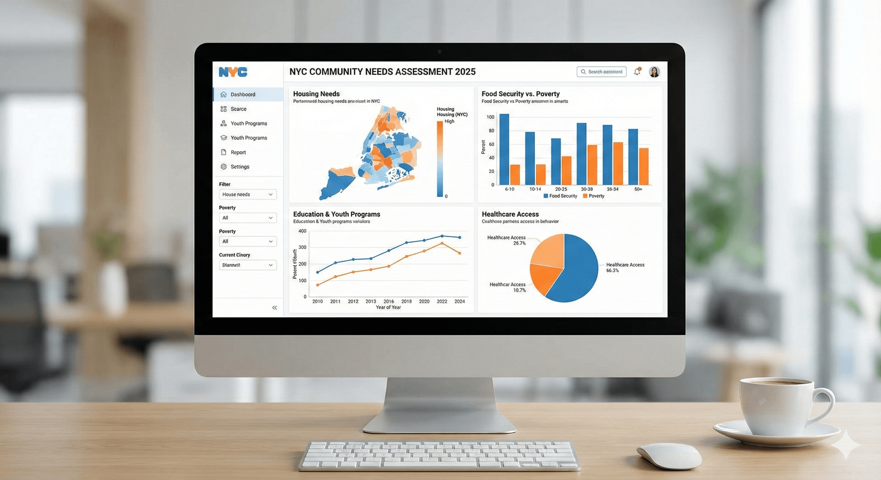
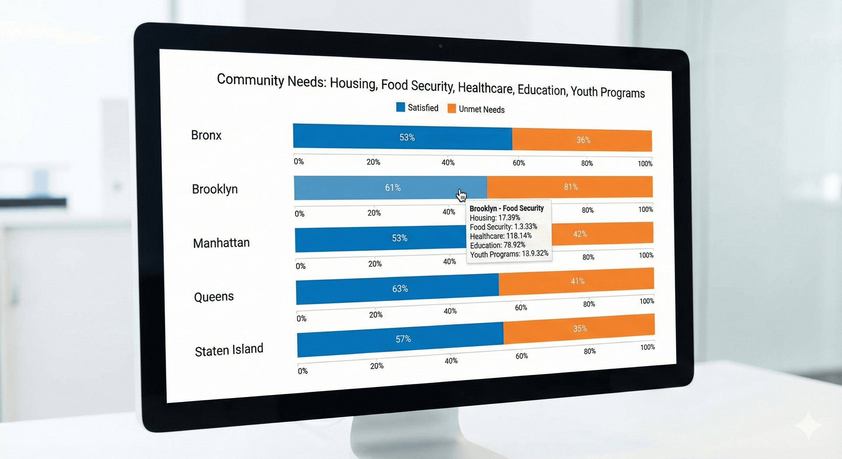
We designed an interactive dashboard that allows users to filter by borough, demographic, and issue area. Clear visualizations highlight trends while preserving the nuance of community voices through integrated quotes and stories.
Results & Impact
The dashboard is now used in monthly coalition meetings and has been cited in three successful grant applications. Member organizations report 60% faster access to relevant community insights.